Observing Basic Elements of Graphic Design
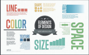
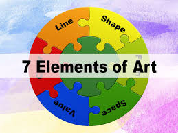
The Seven Basic Elements of Graphic Design
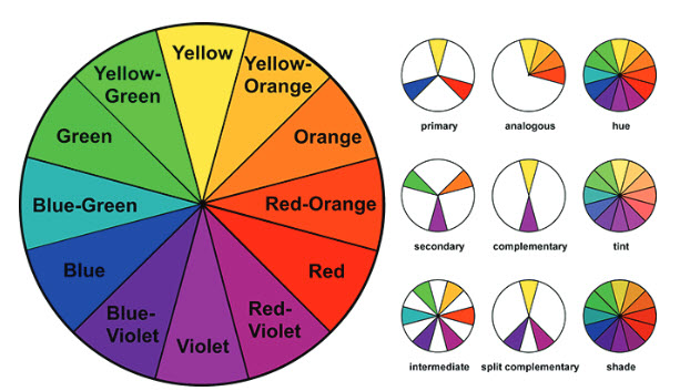
 The spectrum of colours is produced when light passes through a prism (red, orange, yellow, green, blue, indigo and violet) and are arranged in a segmented circle. The modern colour wheel consists of three primary colours—red, yellow, and blue—which can theoretically be mixed in varying ratios to produce Lisecondary and intermediate colours.
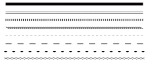
Line
Color
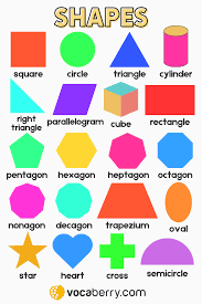
Shape
Value
Form
form refers to objects that are 3-Dimensional, or have length, width, and height. The world we live in made up almost entirely of forms.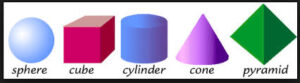
Space
 pace is exactly what it sounds like: the empty areas between elements in your design. When it comes to creating professional- looking designs on your own, sometimes what you do not include is just as important as what you do.
When working on a design, consider not only the elements you are including, such as images and text, but how they are arranged and grouped in the composition.
It can be tempting to fill every inch of your digital canvas withsomething, but try to give your elements some room to breathe.